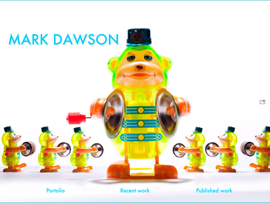
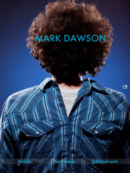
This post marks the start of a different kind of entry – instead of just presenting the results of whatever project I’m working on I am going to share some of the thought process and problem solving that went into the project behind the scenes – at least as much as I can or have time for. Friends and family looking for purty pics are going to be disappointed with posts like this, but hopefully some of my fellow photographers can get something out of my experience when they come to doing this on their own.
So. I finally decided I didn’t feel like wasting another $50+ dollars on prints which I then had to lug around in an increasingly scratched up portfolio book and which would, hopefully, soon be replaced by newer and better photos. Since I don’t have any kind of smart phone and my laptop is nearing death, I figured it was a good time to get an iPad and use that for my portfolio (plus all the other portable functionality).
(I’m still getting organized – this isn’t the final version.)
Here are some notes from my experience so far. In my research for this I had a hard time finding posts like this one that have been written recently – many entries on photography portfolios were about the excitement of the iPad as a new platform – when it first came out a couple of years ago. A lot has changed since then, so here’s my take on it. Add this grain of salt to the others and come to your own conclusions.

Foliobook
I don’t know too many friends who have portfolio apps on their iPads yet, so most of my info is from the Google. I basically cross-referenced what little personal info I had from friends, reviews found online, and my own aesthetic gut feeling, and decided on Foliobook. Other contenders had been “Portfolio”, “Extrafolio”, and a couple of others. The three I named got the best combinations of stars on dpreview.com and mention from friends. In the end I liked the look of Foliobook and it sounded like it has the functionality I’d need.
(Turns out some of the pretty (and award-winning) portfolios using it employ a big dose of workarounds and creative approaches to overcoming the apps shortcomings – more on that later.)
Annoying things
The following are the things I am still frustrated about with this app. I’d list things I like about it, but so far the things I like are really basic things you’d expect any app to do. They are barely a step up from the appallingly featureless iPhoto built into the iPad.
- Essentially no textual instructions. Most of the how-to is in a few short video tutorials that – at their pace, not yours – explain what you can probably figure out intuitively anyhow. I hate this. Probably 80% of the video is stuff I don’t need to waste my time with. I want to be able to scan for keywords I am interested in and read that bit at my pace. Worse: after watching a 3 minute video I discover what I actually wanted to know wasn’t in there at all. Barf.
- Just watched a tutorial through to the end thinking “some of that doesn’t look like what I see” only to hear, at the end of the tutorial “So, that’s how you do it in Foliobook version 1.1” …they are currently on version 3.0!
- No way to easily select all photos. If you have a gallery with many photos in it and you want to replace them all with, say, smaller images, or images with updated metadata, for example, you get to tap on each photo to select it, then delete. And hopefully you don’t accidentally deselect 99 of them before tapping on the 100th or you get to start over.
- No way to change the background color – somewhat like Henry Ford, you can have it in any color you want as long as it is white, black, or light gray. Any of the other pretty background colors in their “Hall of Fame” are apparently images that the user has imported to use for this purpose.
- I am watching the darn tutorials while I type this. The narrator actually just said “Landscape format seems to work better than portrait format, so try to stick with that.” What the hell? We have to photograph horizontally because of a bug in your code? I paid how much for this app?
Wow, I really didn’t start this post intending to bash Foliobook, and given that it has received higher ratings than the others I shudder to think what they are like, but still… I’m a bit disappointed. Knowing what I know now, that the pretty pictures I based much of my decision on are essentially hacks, I’d be interested in Xtrafolio – even if their pretty pictures are also hacks, there seems to be more flexibility and functionality built in. Hell, buying both is still less than what I was going to pay for paper prints…
Foliobook allows for different background images depending on whether the iPad is being held vertically or horizontally.
I’m nowhere near done with this, but the post is getting wordy – shocking, coming from me, I know. I’ll post more after I work up the courage to mess with the app some more. If you go with a different app and feel it is better than this one, please let me know about it!
[Update: I’m just going to keep adding to this post as I get more experience and issues.]
03-May-12: I picked up the portfolio project again today and was, in my frustration, prompted to email Foliobook with my concerns and give them a chance to respond. I’ll post an update when they do.
The Built-in Photos App
I’ve heard from my friend Joel that he just uses the built-in Photos app for his iPad portfolio. The conversation started on Facebook, but I’m bringing it in here just to keep all my thoughts in one place:
- Within Photos you can’t seem to have subfolders for different categories.
- This means that you either have one “Portfolio” folder, or you have your category folders mixed in with whatever other photos are on your iPad. I don’t really want to NOT have other photos on my iPad just to have a clean presentation if I want to show the portfolio. In other words, it seems you’d have something like “Sports, Spot News, Stories, Party last weekend, My cat found a bug, etc.”
- You can’t re-order photos on the iPad. Changing the order requires renumbering the files on your desktop. Also there doesn’t seem to be caption or other data visible in the built-in app. (I can’t believe this is true, so I’m assuming I just haven’t figured it out yet.)
The portfolio apps also seem to offer some bits of functionality that may or may not be useful depending on your situation – a little bit of branding opportunities and “packaging”, or if you were to mail the iPad to a potential client and wanted your portfolio to be locked and play automatically.
All that being said, the differences between the built-in app and the $12.99 Foliobook do not seem to be worth it…


