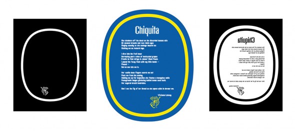
 No, this isn’t a story about a new flavor of chewing gum. The “gum” in the title refers to a photographic printing process called “gum bichromate”, which uses watercolor pigment, potassium dichromate, and the eponymous gum arabic to make the light-sensitive emulsion. The “Chiquita banana” part of the title does, in a couple of twisted ways, refer to Chiquita bananas.
Late last year a friend of mine, Vivienne Leheny, emailed me with what she thought was a slightly strange question: she was wondering if I had any ideas about how to present a poem she wrote which had won a recent competition. It was to be displayed alongside works of a more visual nature – photographs and video pieces – and she needed to figure out how to put her words up on the gallery wall. All she said was that the piece was “a lighthearted nightmare” and that it was called “Chiquita”.
I actually had a project on my list that involved making tri-color prints of quotidian iconic objects like the “Hello, my name is…” sticker, a Bazooka bubble gum wrapper, and, no kidding, the Chiquita banana label. It was the latter, in fact, that gave me the whole idea to begin with as I was staring at a banana over breakfast one morning.
I mentioned to Vivienne that I had this idea. It’s probably a long shot, since I didn’t have a clue what the poem was about, and I was actually worried I’d offend her by even thinking it out loud.
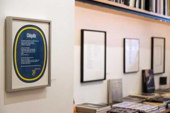
Turns out, when I read the poem, that it seemed like an excellent match, and Vivienne agreed. I proposed a simple (ha ha) print in which I was going to render the blue in cyanotype and the yellow in gum bichromate.
 |
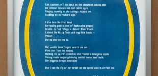 |
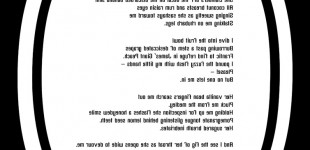
I made some small test prints (the final print was going to be 11×14 inches – didn’t want to waste too much of the expensive French watercolor paper) and everything was going well, I thought. When I started printing larger and looking more closely I realized I was having some unforeseen problems.
Different papers behave differently with the various printing processes. What works for platinum printing might not work as well for salted paper prints, for example. I know that people routinely combine cyanotype and gum, so I didn’t think I’d have any issues. As it turns out if I used a good gum paper the cyanotype wouldn’t clear, and if I used a good cyanotype paper the gum just wouldn’t work at all.
I had to experiment for a bit, and the solution I came up with was to use Arches Platine, a French watercolor paper that works pretty well for gum printing. I had to double coat the cyanotype emulsion and make two layers in order to get a fairly even blue coating.
The best part of making this print was the collaborative process working with Vivienne. We bounced ideas back and forth, and the end result was definitely better than it would have been without her input. It was very rewarding to help make something for somebody else – the print was my idea and vision, but it would have been hollow without Vivienne’s poem, and the print design itself wouldn’t have been as good without her contributions to the creative process.
The exhibit opens today at the Maine Media Gallery in Rockport, Maine. There is an opening reception next Thursday, March 13, 2014, at 5pm.
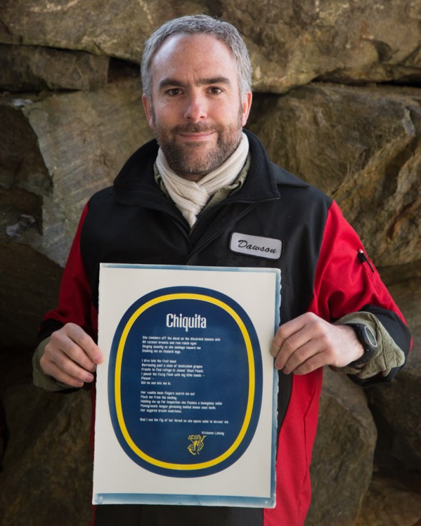
Update: photos from the installation
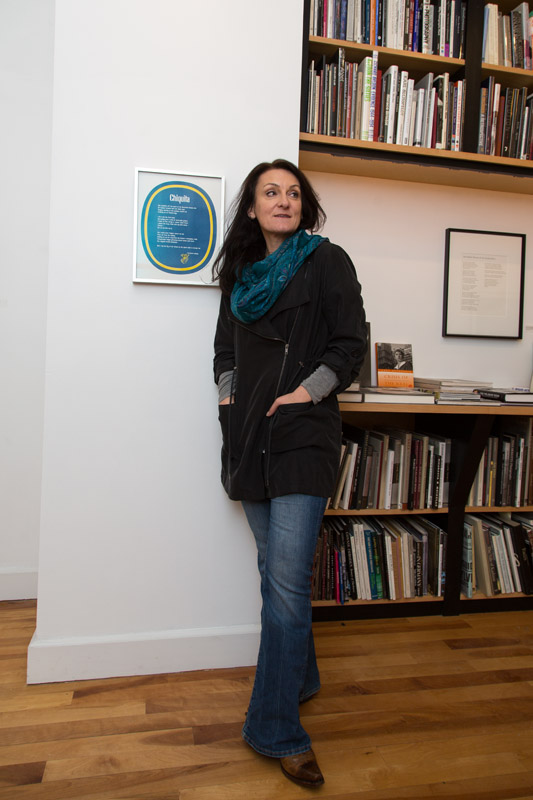
Vivienne and her husband Mark (great name!) came up from New York City for the opening…which got postponed due to potentially nasty weather. We got into the gallery anyhow to see what Chiquita looked like up on the wall.
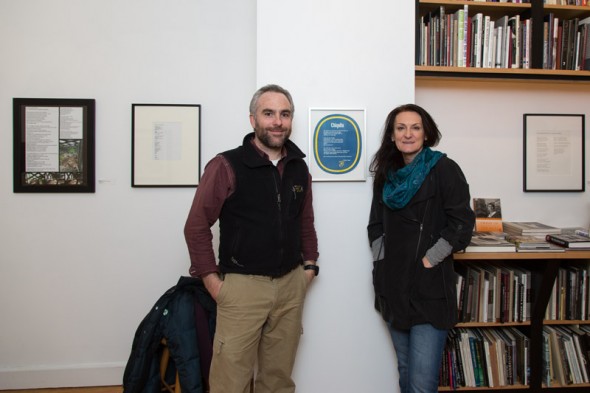
We got a pretty swell spot, if I do say so myself!
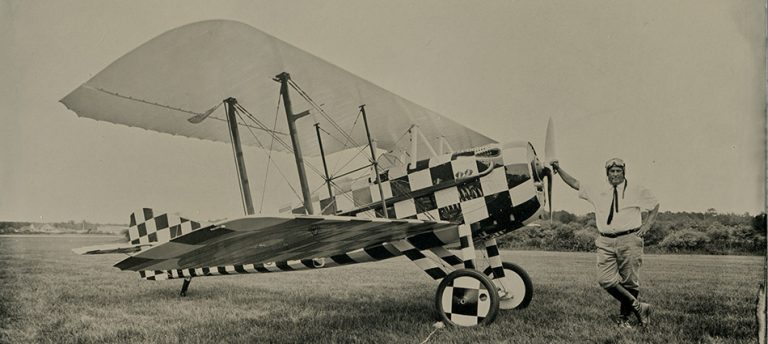
loved seeing the latest. and you, with your handsome new lab coat. r
What a terrific idea, merging the poem with the print. It is a marvellous presentation — congratulations.